If you’ve ever designed something that looked perfect on your screen but didn’t come out quite right in print, you’re not alone.
Whether you’re a trained designer, a DIY creator, or working with freelancers, there’s often a gap between what looks good digitally and what works in production.
At FASTSIGNS® of Springfield, VA, we work with this every day and we can help you with a few simple adjustments that can make a big difference in your final result.
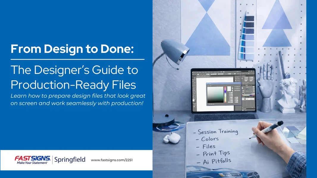
Here are some of the most important things to keep in mind when preparing your files for production:
1. Color: Speak the Right Language
Not all colors are created equal - and more importantly, not all color systems behave the same way.
RGB & Hex Codes: Best for screens and digital use
CMYK: Used for printing, but varies by machine
Paint Codes: Manufacturer-specific (e.g., Sherwin Williams, Benjamin Moore)
Pantone (PMS): The only true universal standard for color matching
If color accuracy matters (especially for branding), Pantone is your safest bet.
Because every printer, fabric, or material can produce color differently. Pantone gives everyone a shared reference point.
2. Contrast Matters More Than You Think
A design can be beautiful - but if it’s hard to read, it won’t work.
Common issues we see:
Colors that are too similar (low contrast)
Text getting lost on busy backgrounds
Combinations that strain the eyes
Simple fixes:
Add a drop shadow
Use strokes (outlines) on text
Place text on a solid or semi-transparent background
These small tweaks can dramatically improve readability - especially in real world conditions.
3. Size Isn’t What You Think It Is
Designing on a computer screen can be misleading.
What looks clear up close might be unreadable from a distance - or when printed at scale.
Key things to consider:
Viewing distance (closer = smaller text is fine, farther = go bigger)
Audience (larger fonts for older audiences)
Movement (signage seen while driving needs even larger text)
Pro tip: Design at actual size (1:1 scale) whenever possible.
And don’t forget to zoom out - or compare it to a real object - to see how it will actually look in real life.
4. Set Up Your Files Correctly From the Start
One of the most common mistakes? Designing in the wrong format.
For example:
PowerPoint defaults to screen dimensions, not print
Files get stretched, cropped, or distorted when resized
Best practices:
Set your artboard size at the beginning
Use the correct color mode (CMYK for print)
Export in the format your production partner requests
And always send:
A high-resolution source file
A flat version (JPEG/PNG) for reference
This ensures everyone is aligned on the final output.
5. AI Is Powerful - But It Has Limits
AI tools can be incredibly helpful but they’re not perfect.
Here are a few pitfalls to watch out for:
Resolution Issues
AI often generates low-resolution images that don’t scale well for print.
Always specify size and DPI when generating assets.
Editing Limitations
It’s harder to edit AI-generated designs later.
Consider generating backgrounds separately and adding text manually.
Accuracy & Ethics
Double-check spelling and details
Make sure you’re using assets responsibly
Be transparent about AI use
QR Codes
Not all QR codes are permanent - some expire after free trials.
Always test your QR codes before printing.
Good design isn’t just about how something looks - it’s about how it performs in the real world.
By understanding how color, size and file setup impact production, you can avoid costly mistakes and get results that match your vision.
For a Deeper Walkthrough
We recently hosted a live session covering these topics in more detail, including real examples and common mistakes to avoid.
Watch the full webinar recording here.
Need Help Getting It Right the First Time?
At FASTSIGNS® of Springfield, VA, we help turn your ideas into finished products that look exactly how you expect - on screen and in real life.
Whether you need guidance on file setup, color matching, or full production support, our team is here to help.


