First Off. What Are Pantone Colors?
It is a universal vocabulary of color that facilitates color specific choices through every stage of the workflow for businesses and individuals. Let’s see if your favorite color made it.
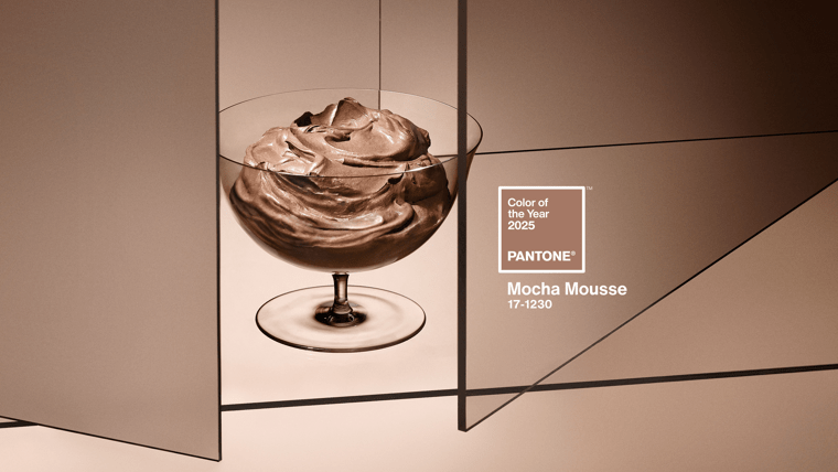
2025 - Pantone 17-1230 Mocha Mousse
“Find your mocha moment” is the tagline behind Pantone’s 2025 Color of the Year, Mocha Mousse – a luxurious brown hue that echoes our pursuit of comfort, blended with thoughtful indulgence.
Mocha Mousse is inspired by our desire for daily comforts – known lately as ‘little treat culture’. The color calls to the small pleasures of the average person, like a latte before someone’s morning commute. Along with other notes, like earthiness, warmth, or luster, Mocha Mousse conveys a sense of harmony with the mundane. According to Laura Pressman, vice president of the Pantone Color Institute, it is a color with “sensorial and comforting warmth.”
The Color of the Year is meant to encapsulate a ‘global zeitgeist’ of the upcoming year – a mood or attitude, shared cross-culturally and meant to initiate a conversation about the relationship between color and culture. This can set a precedent for what will be engaging and noticeable to consumers in the upcoming year.
Chris Brooks, VP of Creative Services at FASTSIGNS, touches on this: “Color trends often reflect the cultural, social, and psychological mood. By staying up-to-date with these trends, a business can visually resonate with their audience and align with evolving tastes and preferences.”
With one facet of the upcoming year’s design forecast established, integrate this inviting and universal hue into your creative deliverables, whether it be printing, branding, interior design, fashion merchandising and more. Rely on the design experts at FASTSIGNS to suggest eye-catching color combinations to increase your business visibility – or to create your customer’s ‘Mocha Moment.’
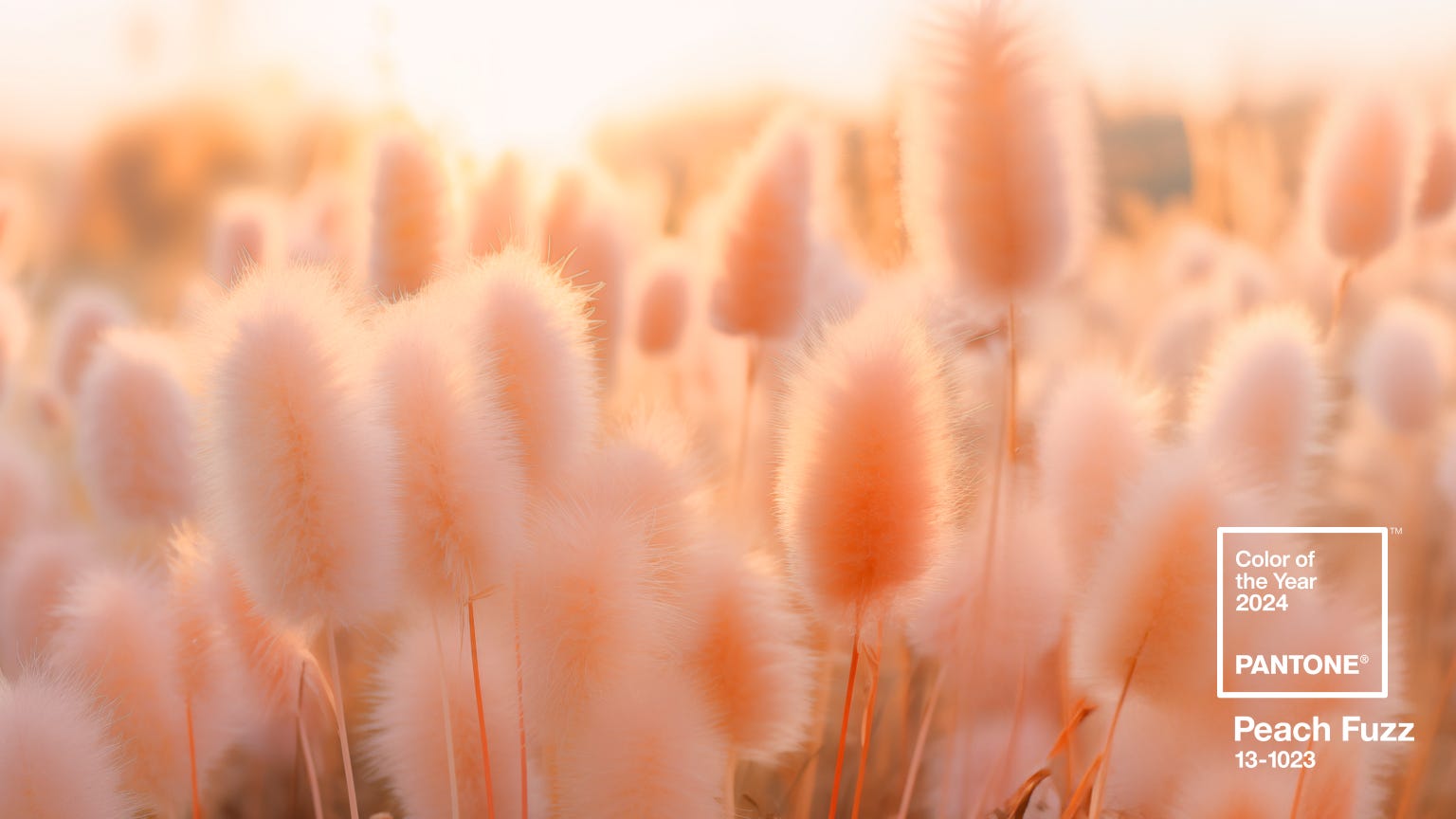
2024 - Pantone 13-1023 Peach Fuzz
With the tagline, “Embrace the Warmth,” Peach Fuzz is the ideal blend where orange kisses pink, a warm-toned color that conveys a sense of coziness, togetherness and serenity. This year marks the 25th year that Pantone has revealed its color of the year that impacts trends in everything from paint colors to fashion, and home design to makeup.
The inspiration for the light and airy hue was in direct contrast with the heaviness of the world around us full of uncertainty and turmoil - a respite in a color that is both nurturing and warm. Martha Stewart.com describes it as “a gentle peach that's softly nestled between pink and orange.” Some speculate that this selection grew out of the popularity not for the official 2023 Pantone Color of the Year, Viva Magenta but rather PMS 2019C, which is the Barbie Pink color. We at FASTSIGNS have been following this trend and agree.
“In seeking a hue that echoes our innate yearning for closeness and connection, we chose a color radiant with warmth and modern elegance. A shade that resonates with compassion, offers a tactile embrace, and effortlessly bridges the youthful with the timeless,” said Executive Director of Pantone Color Institute, Leatrice Eiseman.
For visual communications and signage, the possibilities are endless. “For business environments who are particularly focused on creating the sense of comfort, connection, peace and nurturing, this is a trendy color that can be explored with your graphic and design team,” says Chris Brooks, VP of Creative Services at FASTSIGNS. “Color trends often reflect the cultural, social, and psychological mood. By staying up-to-date with these trends, a business can visually resonate with their audience and align with evolving tastes and preferences.”
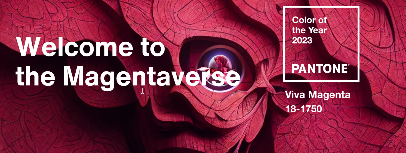
2023 - Pantone 18-1750 Viva Magenta
Pantone has selected an unconventional shade for an unconventional time that highlights a new vision.
“In this age of technology, we look to draw inspiration from nature and what is real. PANTONE 18-1750 Viva Magenta descends from the red family, and is inspired by the red of cochineal, one of the most precious dyes belonging to the natural dye family as well as one of the strongest and brightest the world has known. Rooted in the primordial, PANTONE 18-1750 Viva Magenta reconnects us to original matter. Invoking the forces of nature, PANTONE 18-1750 Viva Magenta galvanizes our spirit, helping us to build our inner strength.” - Leatrice Eiseman, Executive Director of Pantone Color Institute
Viva Magenta is brave and fearless, playfully disruptive and fun, a stand-out statement. It is a pulsating color whose exuberance promotes a joyous and optimistic celebration, writing a new narrative. Vibrating with vim and vigor, a shade rooted in nature descending from the red family demonstrates a new signal of strength.
This transformative red tone is capable of driving design to create a more positive future and brings with it a new vision of design, innovation and self-expression. Through the Magentaverse, they are constructing what the future could and will be like, and where exploration abounds.
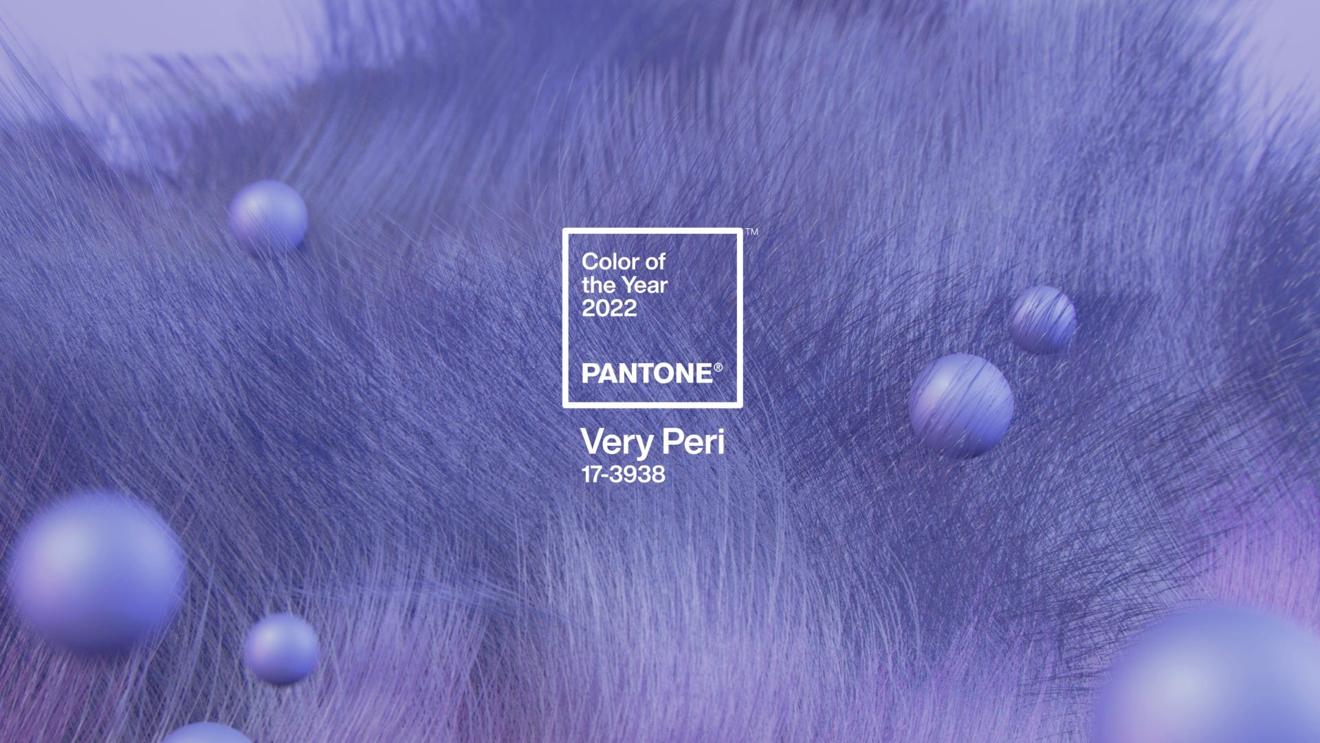
2022 - Pantone 17-3938 Very Peri
Associated with open spaces, including the sea and the sky, the color blue represents freedom, imagination and sensitivity among other things. It also evokes feelings of trust and stability. The Very Peri color is blue married with undertones of red and violet, colors that often represent passion and love. It is described as a color “whose courageous presence encourages personal inventiveness and creativity,” and that will help us “to embrace this altered landscape of possibilities, opening us up to a new vision as we rewrite our lives.”
Visit a sign maker near you at FASTSIGNS! Get a quote now!
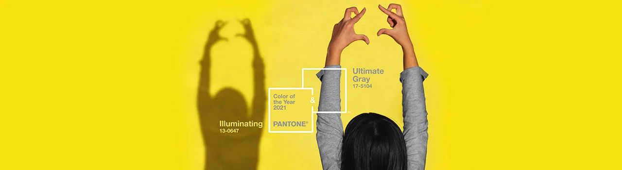
2021 - Pantone 17-5104 Ultimate Gray + Pantone 13-0647 Illuminating
Touching on the duality of our world as it pushes forward during a devastating pandemic, these two colors are said to highlight how different elements can come together to support one another. Gray can be bleak, but it can also be strong and works as a wide-reaching foundational color. Stark next to a bright yellow, it highlights the strength and positivity we brace ourselves with as we enter 2021.
“The union of an enduring Ultimate Gray with the vibrant yellow illuminating expresses a message of positivity and fortitude. Practical and rock solid but at the same time warming and optimistic, this is a color combination that gives us resilience and hope. We need to feel encouraged and uplifted; this is essential to the human spirit.
2020 - Pantone 19-4052 Classic Blue
The PANTONE® Color of the Year is so much more than a swatch. It inspires trends from interior design to sneakers, influences branding in every industry and captures the emotional tone of the year for posterity. Pantone’s color chart provides color codes to ensure accurate and consistent communication for designers across the globe. The Pantone Color Institute conducts research on how color influences human thought processes, emotions and physical reactions to help professionals utilize it more effectively. This Institute has selected a color each year since 2000 that best represents the design trends and global zeitgeist of the times.
The 2020 Pantone Color of the Year helps sets the stage for an all new era as we approach the next decade in our history. Described as a timeless and enduring hue that is elegant in its simplicity, the 2020 Pantone Color of the Year is PANTONE 19-4052 Classic Blue. Stepping into the New Year, this comforting yet captivating shade represents a common desire for stability while encouraging resilience.
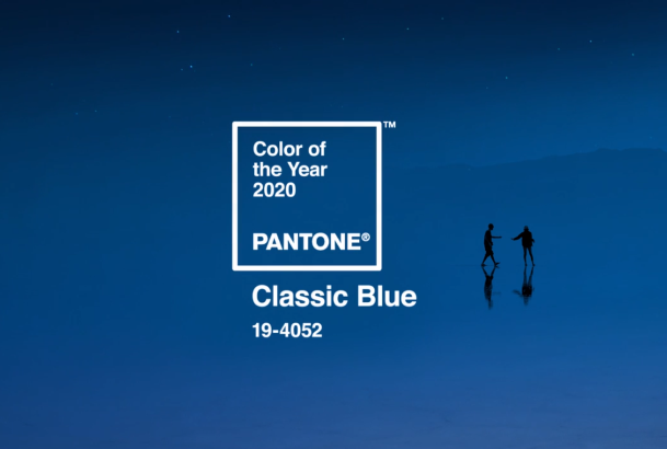
“We are living in a time that requires trust and faith. It is this kind of constancy and confidence that is expressed by PANTONE 19-4052 Classic Blue, a solid and dependable blue hue we can always rely on,” said Executive Director of the Pantone Institute, Leatrice Eiseman. “Imbued with a deep resonance, Classic Blue encourages us to look beyond the obvious to expand our thinking; challenging us to think more deeply, increase our perspective and open the flow of communication.”
As we close the door on the 2010’s, let’s take a look back over the past 10 years as defined by their Pantone colors…
2019 – Pantone 16-1546 Living Coral
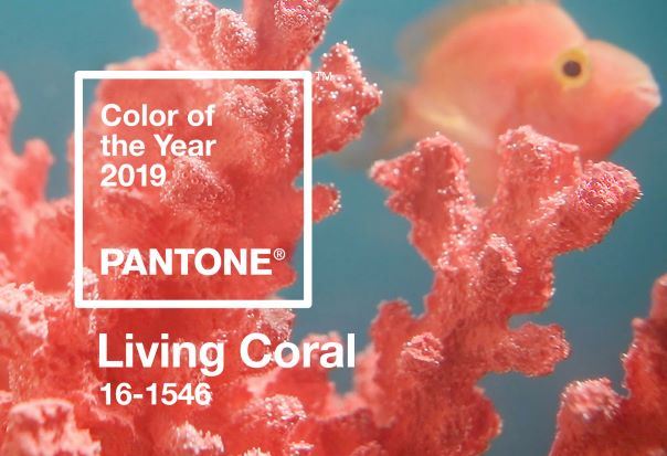
Named vibrant, yet mellow, Pantone's 2019 color of the year is known for its striking and bold presence throughout the world's natural surroundings as well as our Instagram feeds. Living Coral emanates a sense of lightheartedness and optimism which is something everyone is looking forward to in the new year.
“Color is an equalizing lens through which we experience our natural and digital realities and this is particularly true for Living Coral,” said Eiseman."With consumers craving human interaction and social connection, the humanizing and heartening qualities displayed by this color hit a responsive chord."
2018 – Pantone 18-3838 Ultra Violet
.jpeg)
In 2018 Pantone chose a color that was heavily based on our love of exploration that also pays homage to lost legends. Ultra Violet is a dramatic and mysterious purple shade meant to evoke the vast night sky. Inspired by the new space race, this color also looks back on the people who made purple what it is – icons like Prince, David Bowie, and Jimi Hendrix.
“We are living in a time that requires inventiveness and imagination” commented Eiseman. “It is this kind of creative inspiration that is indigenous to PANTONE 18-3838 Ultra Violet, a blue-based purple that takes our awareness and potential to a higher level. From exploring new technologies and the greater galaxy, to artistic expression and spiritual reflection intuitive Ultra Violet lights the way to what is yet to come.”
2017 – Pantone 15-0343 Greenery
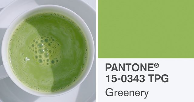
2017 brought us a bright inspiring yellow-green as the color of the year. A color meant to remind us all of a fresh spring day, where you wake up to the birds chirping and step outside to breathe in the fresh clean air. This color was inspired by the return to nature. Pantone stated “The more submerged people are in modern life, the greater their innate craving to immerse themselves in the physical beauty and inherent unity of the natural world. This shift is reflected by the proliferation of all things expressive of Greenery in daily lives through urban planning, architecture, lifestyle and design choices globally.”
Eiseman explained, “Greenery bursts forth in 2017 to provide us with the reassurance we yearn for amid a tumultuous social and political environment. Satisfying our growing desire to rejuvenate and revitalize, Greenery symbolizes the reconnection we seek with nature, one another and a larger purpose.”
2016 – Pantone 13-1520 + Pantone 15-3919 Rose Quartz and Serenity
.jpeg)
For the first time in their history Pantone decided to choose two colors for the 2016 Color of the Year. Based on what they saw culturally and socially within the changing gender movement, Pantone chose two colors that can be blended together and change. They sought to challenge the traditional views of color association.
On the two-color choice Eiseman said, “Joined together, Rose Quartz and Serenity demonstrate an inherent balance between a warmer embracing rose tone and tranquil blue, reflecting connection and wellness as well as a soothing sense of order and peace.”
2015 – Pantone 18-1438 Marsala
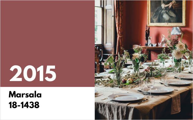
Inspired by the strong fortified wine bearing the same namesake, Marsala was the color chosen for 2015. A deep earthy reddish-brown made for an amazing accent color for the home, clothing and accessories, Pantone described Marsalas as a color that enriches our minds, bodies and souls.
“Marsala is a subtly seductive shade, one that draws us in to its embracing warmth,” said Eiseman. “It’s a color that is universally appealing and translates easily to fashion, beauty, industrial design, home furnishings and interiors.”
2014 – Pantone 18-3224 Radiant Orchid
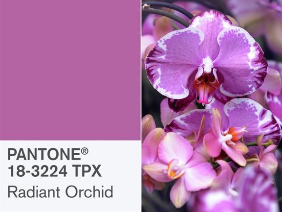
The Pantone Color of the Year for 2014, Radiant Orchid, is a bright combination of fuchsia, purple and pink. Encouraging originality and creativity, it made sense for a year that saw amazing technology breakthroughs and the continued rise of small business success in America. Eiseman explained the choice for the Pantone Color of 2014, “Radiant Orchid inspires confidence and emanates great joy, love and health. It is a captivating purple, one that draws you in with its beguiling charm.”
2013 – Pantone 17-5641 Emerald Green
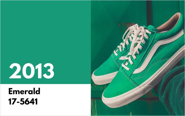
Vivid and verdant, Emerald reflected the renewal and growth the nation was relieved to experience in 2013. Emerald represents prosperity, sophistication and luxury in many cultures making it a stylish choice for high-end fashion and home goods.
Eiseman said in the press release, “As it has throughout history, multifaceted Emerald continues to sparkle and fascinate. Symbolically, Emerald brings a sense of clarity, renewal and rejuvenation, which is so important in today’s complex world.
2012 – Pantone 17-1463 Tangerine Tango
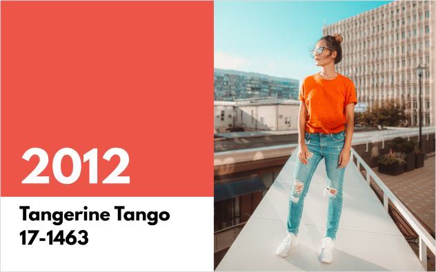
Tangerine Tango is an optimistic reddish orange. This color was featured prominently by fashion designers in 2012 with Tommy Hilfiger, Nanette Lepore, Elie Tahari and Adrienne Vittadini showcasing it in their spring collections.
The release announcing its selection described Tangerine Tango as the energy boost we needed in order to recharge and move forward.
2011 – Pantone 18-2120 Honeysuckle
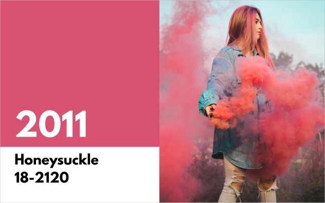
In 2011 Pantone selected Honeysuckle, a dynamic reddish pink. Pantone also released a popular line of bridesmaid dresses with The Dessy Group in 200 colors and the Honeysuckle dress was everywhere at 2011 weddings
“Honeysuckle emboldens us to face everyday troubles with verve and vigor…Honeysuckle is encouraging and uplifting,” the release explained. “It elevates our psyche beyond escape, instilling the confidence, courage and spirit to meet the exhaustive challenges that have become part of everyday life.”
2010 - Pantone 15-5519 Turquoise
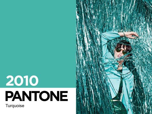
In 2010 the financial crisis was still affecting many Americans and Pantone decided we could all use a little escape.
“Turquoise is believed to be a protective talisman, a color of deep compassion and healing, and a color of faith and truth, inspired by water and sky,” said Eiseman. “Through years of color word-association studies, we also find that Turquoise represents an escape to many – taking them to a tropical paradise that is pleasant and inviting, even if only a fantasy.”
Do you remember these color trends throughout the years? You may recall them better than other events. Research shows that our memory works better with color than black and white. Definitely something to consider in future store décor and brand design.
Resources:
http://www.pantone.com/pages/pantone/index.aspx
http://mike.teczno.com/notes/pantone-colors.html
http://www.dailymail.co.uk/news/article-112944/Why-memories-work-better-colour.html