Comic-Con is coming to San Diego July 23-27 and for the 45th year in a row Wonder Women, Wookies, Klingons and studio executives will share a mutual love of comics and celebrate this art form’s contributions to our culture. Original comic art has become so much more than stories for kids told on newsprint: it has inspired wonderful films, given us American icons and had a significant influence on the world of graphic design. Let’s take a look at some current design trends and trace them back to their comic book roots.
Comics as Art
Pop artist Roy Lichtenstein (1923-1997) was a key player in the Pop Art movement of the 1960’s. He was most well-known for combining comic book art with a deep understanding of Cubism and composition to elevate the medium. The influence of his work is seen throughout the design world today, sometimes quite literally with winking references and Ben Day dots, and other times in more subtle ways, such as a the use of comic art, bold primary colors and thick dark lines in graphic and product design.
Flat Web Graphics
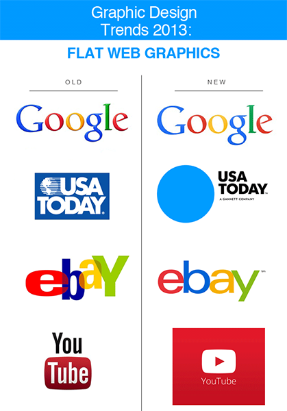
The era of the drop shadow may be over. Digital design initially brought a lot of texture to graphics (shadows, glosses, layers) but changes to many major corporate logos and interfaces show the tide may be turning back toward more comic-like flat graphics. Google, Apple and eBay are just three examples of major brands that have dropped the drop shadow to simplify their corporate identities.

Classic Movie Posters
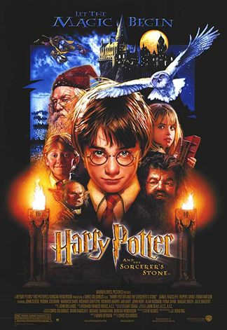
Everyone is familiar with the classic movie poster that features the hero front and center, flanked by all the amazing secondary characters that fill in the story’s universe. What you may not know is that this format originated from comic book graphic design. Old comics were thick 50+ page anthologies featuring many different characters. Woody Woodpecker may take center stage on the cover, but the supporting cast was featured along the left hand side as well. Why on the left? Because newsstands and comic book stores would cram volumes onto the shelves by overlapping them so only an inch or two of the left side showed (this is also why publisher’s logos always appear on the left side of a comic book cover).
Many comic book-based film posters follow the convention of showing multiple characters, but it also became the norm for almost any sci-fi or fantasy movie:

Pen and Watercolor Graphics
Romantic watercolor washes over precise pen drawing has been a major trend in graphic design in recent years. This is especially true for event invitations, high fashion and women’s brands such as Fresh Produce. This trend is at least partially inspired by beautiful graphic novels that used these mediums to illuminate their stories. Long Tail Kitty by Lark Pien and Beautiful Darkness by Fabien Vehlmann are two excellent examples.
The influence of comic art on graphic design is a fascinating topic. Want to learn more? This Salon.com article recaps a 2011 Comic-Con panel with famous designers discussing how comics impacted their work. Interested in the history of movie poster design? Check out the excellent documentary Drew: The Man Behind the Poster. Finally, Graphic Design: A New History is the ultimate text on how everything from politics to comics to technology influenced the design field.
Resources:
http://www.salon.com/2011/08/09/graphic_art_imprint/
http://www.moma.org/collection/artist.php?artist_id=3542
http://www.imdb.com/title/tt1486843/
http://www.designhistory.org/PostModern_pages/EndInternational.html
http://99designs.com/designer-blog/2013/01/22/polka-dots-art-the-cosmos-and-graphic-design/