Simply put, the’ figure’ is what your eye is drawn to and what you focus on. And the ‘ground’ is everything else. These are also often referred to as the positive and negative space of an image - the positive is the ‘figure’ and the negative is the ‘ground’. Both are equally important in visual communication, and the interaction between them is also very important.
The concept of figure-ground in graphic design comes from the same namesake in psychology. Gestalt psychology teaches that figure-ground precedes all other visual perceptual skills and is one of the first to develop in a young baby. The development of perceptual organization develops as early as infancy in human beings. From our earliest ability to perceive the world around us the brain is using the differentiation in perception as a way of interpreting the world.
Figure-ground in design capitalizes on this understanding and ensures that the interaction you have with a piece of visual communication happens naturally. There are several ways that a designer may use contrast between positive and negative space:
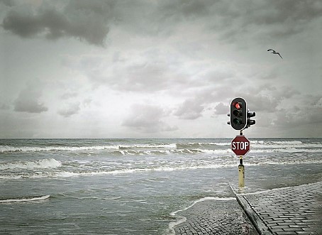
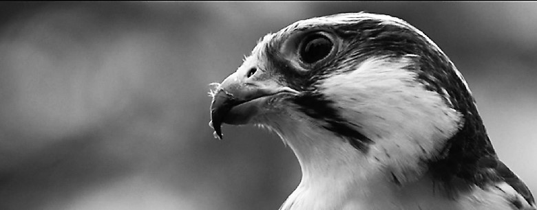
Blur: Elements in the image that are in focus will be perceived as ‘figure’ while elements that are out of focus, blurred, faded, or tinted, will be perceived as ‘ground’. One way to use blur is on a highly detailed and busy background that would otherwise detract from the figure. By blurring this, the brain automatically discounts it and remains focused on the figure.
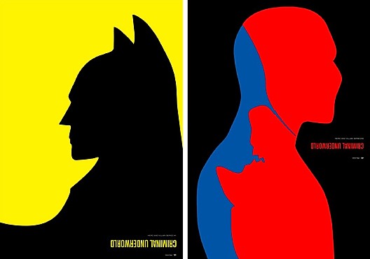
Contrast of color: Color not only adds life to a design, it also can be used to reinforce relationships, especially if using abstract shapes to represent forms. Warm colors, such as yellows, oranges and reds, are perceived as approaching and can be used to strengthen ‘figure’. Cool colors, such as purples, blues and greens, are perceived as receding and can be used to strengthen ‘ground’. Contrast of colors can add depth and impact the interpretation of the figure a great deal.
Placement of the figure in the ground: there are several different ways in which the figure can be placed that will offer visual cues to the audience. Human perception rules play into this a great deal. For example, elements in an image that are below a horizon line are more likely to be perceived as ‘figures’, while the elements above a horizon line are more likely to be perceived as ‘ground’. Even without a horizon line, those elements in the lower region of the image are more often perceived as ‘figures’. Usually the ‘figure’ will seem closer, and have a clear location in space, while the ‘ground’ will remain farther away. And in some images, the ‘figure’ will have more definitive shape, while the ‘ground’ remains more shapeless.
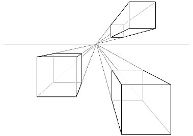
Size: whether the ‘figure’ is made very large with minimal ‘ground’ or the reverse where the ‘figure’ is quite small on a large ‘ground’, both create a size contrast that creates a visual cue. This effect of size is where space is incorporated into the design that can be used to declutter and focus an image. Size contrasts and their creation of space can create emphasis and hierarchy. They can also create drama and tension. The size of the ‘figure’ and the ‘ground’ should always be intentional.