As you have built your business or organization over the years, you have worked to craft a clear brand identity to represent it. Moving to a new location or expanding in a current space provides the perfect opportunity to assess your visual elements to ensure that your signs and visual graphics help reinforce your current brand identity. These three companies did just that.
1. School of Rock

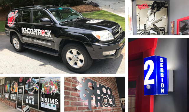
When a new School of Rock location was opening in Snellville, GA, the owner wanted the signs and graphics to communicate the music education center’s distinct personality in a brand-friendly way.
Branded channel letters identify the building at a distance while rock and roll-themed window and door graphics outline operational hours, designate entrances and promote the various educational services offered. Graphics installed on the owner’s vehicle promote School of Rock while driving around the community. Large branded wall graphics and an LED backlit logo help set the tone in the lobby area. Lesson rooms with numbered session room identifiers were incorporated into the light fixtures to create a recording studio vibe.
The fun and vibrant signs and graphics effectively brand the new School of Rock location while communicating what they offer to potential customers. The School of Rock in Snellville has experienced growth ahead of initial projections for the new location.
2. Hoekstra Transportation


Hoekstra Transportation, LLC in Kankakee, IL relocated and wanted to build a state of the art facility that would attract high quality drivers and communicate their desire to provide a positive culture for employees.
The building’s exterior was utilized as a branding opportunity by placing a large aluminum box sign with raised text and graphics, along with coordinating metal canopies. To increase visibility from a nearby major interstate, a 12.5’ x 62.5’ banner was installed on the backend of the facility.
Several wall murals inside the building were made with brushed aluminum, coordinating with their branding elements. ADA and wayfinding signs were designed with the Hoekstra logo incorporated throughout the building’s interior. Frosted vinyl on glass partitions and office doors, framed company images and mission statements, wall graphics and vending machine graphics also extended the brand elements in the new space.
Hoekstra Transportation’s new facility reflects their culture and position as a trusted carrier in the transportation industry.
3. Anthony’s Pizza & Subs

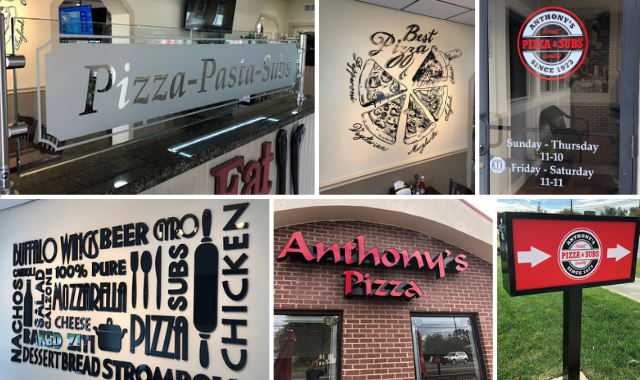
Anthony’s Pizza & Subs in Winchester, VA relocated and needed to make a strong visual impression both inside and outside their new location. The owners also wanted to communicate that they are more than just a pizza shop.
The Anthony’s Pizza & Subs logo was redesigned to better align with their goal of being viewed as a casual dining restaurant. Large channel letters spelling out the Anthony’s name were installed on the building’s exterior to get attention from the road. New lighted “Enter” and “Exit” directional signs help guide traffic flow at all hours. Inside the restaurant, dimensional wall graphics and murals serve as unique decor that reinforce Anthony’s Pizza & Subs brand message. Etched and frosted glass panels provide a visual barrier between diners and extend the branding to the decor. The restroom and ADA signage were also designed to complement the new look and feel.
The new logo, signs and visual graphics helped Anthony’s Pizza & Subs provide a more family-friendly atmosphere for diners and establish itself as a casual dining restaurant that provides more than just pizza.
Companies should evaluate their branding and visual graphics when relocating and take advantage of the blank canvas opportunity that comes with a new location. Need to rebrand a new or acquired space? FASTSIGNS® is more than ready to help.