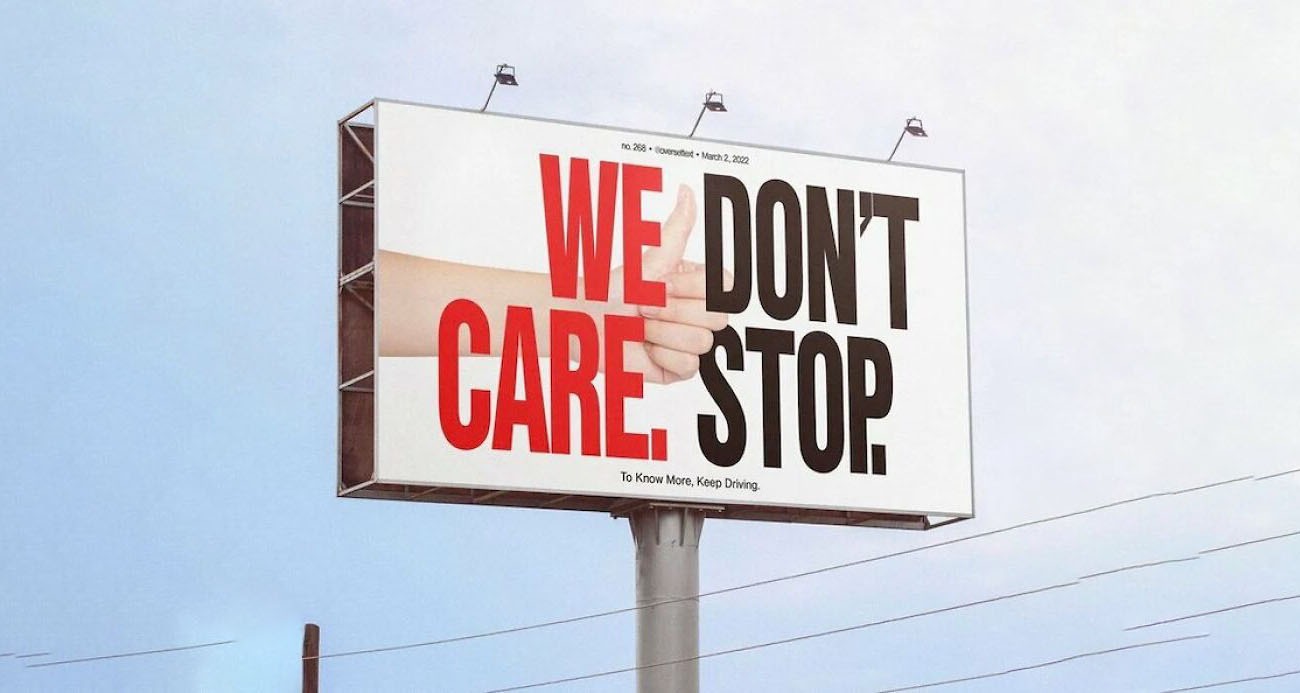
Credit: Bored Panda
Key Takeaways:
Most sign design mistakes come down to three core problems: too much information, too little contrast and no clear visual hierarchy to guide the eye.
Viewing distance determines almost every design decision, including font size, color choice and the amount of content that can realistically fit on a sign.
Fixing a design mistake before production costs nothing. Fixing it after the sign is installed, printed or fabricated costs significantly more in time and money.
A bad sign does not just fail to attract customers. It actively works against your business by communicating carelessness or confusion before anyone walks through your door. The frustrating part is that most sign design mistakes are not caused by a lack of creativity. They are caused by a lack of a clear review process before the job goes to print.
The mistakes below cover the full range, from layout and typography to material and lighting decisions. Each one includes a before-and-after visual so you can see the difference, not just read about it. FASTSIGNS works with business owners at every stage of the design process to catch these issues before they become expensive problems. Find a location near you or request a quote to get started.
The Most Common Sign Design Mistakes
Every mistake on this list has one thing in common: it makes your sign harder to read, remember or trust. Work through them in order. Most businesses will recognize at least three.
Mistake 1: Too Much Text on the Sign
A sign is not a brochure. It has two to five seconds to communicate its core message to someone who is moving past. Every word you add past the essential message reduces the chance that any message lands at all.
The fix is prioritization, not editing for its own sake. Ask: what is the single thing this sign needs to communicate? Usually it is a name, a category or a call to action. Everything else belongs on a secondary surface, a window graphic or a website. If you cannot read the sign aloud in under three seconds, it has too much text.
Mistake 2: Choosing a Font That Cannot Be Read at Distance
Script fonts, ultra-thin weights and heavily decorative typefaces may look elegant close up. At the distances where most signs need to work, they collapse into visual noise. The type sizing standard most sign professionals follow is one inch of letter height for every ten feet of viewing distance.
A bold sans-serif or a high-stroke-contrast serif will almost always outperform an ornate font in real-world sign conditions. Save the decorative typography for packaging, menus and materials that people hold in their hands.
Mistake 3: Insufficient Color Contrast
High contrast is not a stylistic choice on a sign. It is a functional requirement. WCAG contrast guidelines recommend a minimum contrast ratio of 4.5:1 for standard text. Signs that look fine on a screen or a design proof frequently fail this threshold when installed in real lighting conditions.
Black on white, white on dark blue and dark green on white are reliably high-contrast combinations. Yellow on white, light gray on white and red on green are reliably poor. Test your color choices against the actual background and lighting conditions of the installation location, not just on your monitor.
Mistake 4: Ignoring Viewing Distance in the Design Phase
Most sign designs are created at desktop scale and never tested at real viewing distance before production. This produces signs with body copy, taglines and supporting information that no one past five feet away can read.
The ISA sign effectiveness guidelines treat viewing distance as the starting point of every design decision, not a finishing check. Map out where your audience will first see the sign, how fast they will be moving and how much time they realistically have to read it. Then build the design backward from those constraints.
Mistake 5: Inconsistent Branding Across Sign Types
A business with three sign types using three different color palettes communicates inconsistency before a customer ever forms a conscious opinion. Brand recognition depends on repetition. When the colors, fonts and logo treatment change between your exterior sign, window graphics and sidewalk sign, you are starting from zero with every new surface.
The fix is a simple brand standard document that specifies exact colors (hex and PMS codes), approved typefaces, logo clear space and minimum size rules. Share it with every vendor before any sign goes into production.
Mistake 6: No Visual Hierarchy
Visual hierarchy is what tells a viewer's eye where to start and where to go next. Without it, a sign reads as a block of equal-weight information and the eye does not know what to prioritize.
Establish a clear primary element (usually the name or the offer), a secondary element that supports it and a tertiary element only if the sign size genuinely supports three tiers. Size, weight and color contrast are the three tools that create hierarchy. Use them deliberately, not decoratively.
Mistake 7: Wrong Sign Size for the Location
Undersized signs are more common than oversized ones in retail environments. A sign that looks proportionate in a design mockup can disappear against the scale of the actual building facade or the visual competition of a busy commercial street.
The general rule is that a sign should fill 70 to 80 percent of the available mounting width while respecting local code limits. When in doubt, mock up the sign at full scale using paper or a projected image against the actual facade before finalizing fabrication. It takes an hour and saves the cost of a replacement.
Mistake 8: Stretching or Distorting the Logo
A stretched or compressed logo communicates one thing immediately: this was not done by someone who cares about the brand. It also makes the logo harder to recognize because the proportions have changed from every other context where the viewer has seen it.
Every logo should have a locked aspect ratio that never changes. If the logo does not fit the sign dimensions, the answer is to resize the sign, adjust the layout or redesign the sign rather than distort the logo. Build the sign around the logo, not the other way around.
Mistake 9: Using Low-Resolution Images or Graphics
Images that look fine on a website at 72 DPI will print at very low quality on a physical sign. Print-quality artwork requires a minimum of 300 DPI at the final output size, and large-format signs often require vector files for graphics that will scale to any dimension without degrading.
Before sending any file to production, request a proof at actual size or ask your sign provider to confirm that all image assets meet the required resolution. Catching this at the artwork stage costs nothing. Discovering it after the sign is printed means a reprint.
Mistake 10: Ignoring Lighting Conditions at the Installation Site
A sign designed in a bright studio environment will behave very differently on a north-facing shaded wall, under a building overhang or in a location that gets heavy afternoon glare. Colors shift, contrast drops and readable designs can become invisible in the wrong lighting conditions.
Walk the installation site at different times of day before finalizing a design. If the location is shaded for most of the day, prioritize high-contrast colors and consider illumination. If it faces into the afternoon sun, avoid color combinations where glare will wash out the message.
Mistake 11: Using the Wrong Material for the Environment
Every sign material has a context where it performs well and a context where it fails quickly. Vinyl banners are built for short-duration promotions, not permanent outdoor installations. Foam core board works for indoor displays, not exterior signs. Standard vinyl graphics applied to a surface that sees constant moisture will peel within months.
Match the material specification to the sign's location, exposure and intended lifespan from the start. FASTSIGNS consultants match substrate recommendations to specific installation environments rather than defaulting to the lowest-cost option for every application.
Mistake 12: Skipping the Proof Before Production
Production-ready artwork should go through at least two rounds of human review before any fabrication begins. Spell check tools miss correctly spelled wrong words. Design proofs miss scale issues. A fresh set of eyes in a different format (printed at small scale or viewed on a mobile screen) catches errors that disappear on a desktop monitor.
Build a review checklist into your production workflow rather than relying on memory. At minimum, review spelling, logo accuracy, color codes, phone numbers or URLs and physical dimensions before signing off on any sign proof.
Sign Design Review Checklist
These are the decisions that separate a sign that works from one that gets replaced. Run through them before approving any proof, at any budget and for any sign type.
Keep text to a minimum. If you cannot read the sign aloud in three seconds, cut it down.
Match font size to viewing distance. One inch of letter height for every ten feet between the sign and your audience.
Check contrast in real conditions. Step outside and look at the design in adequate light before approving it.
Lock your logo proportions. Never stretch or compress. Build the layout around the logo, not the other way around.
Use no more than two typefaces. Different weights within one family are almost always enough.
Match materials to the environment. Short-duration material in a permanent location is a reprint waiting to happen.
Specify exact color codes. Hex and PMS, not "something close to navy."
Check image resolution before production. 300 DPI minimum at final output size, or vector format.
Get a second reviewer on the proof. Spell check does not always catch correctly spelled words in the wrong place.
Walk the installation site at different times of day. Lighting changes everything and most designs are only reviewed on a monitor.
Sign Design Mistakes: Frequently Asked Questions (FAQs)
Common questions about sign design come down to the same practical concerns: how to avoid the most expensive mistakes and how to know when a design is actually ready to go to production.
How many fonts should a sign use?
Most effective signs use one typeface family, selecting different weights (bold for the headline, regular for secondary text) to create hierarchy without visual noise. Two families is the maximum before a design starts to feel unfocused. More than two typefaces on a single sign is almost always a mistake regardless of how they look individually.
What is the most common mistake businesses make when designing signs?
Overloading the sign with information is the single most frequent problem. Business owners understandably want to communicate everything: name, tagline, services, hours, phone number and website. The result is a sign that communicates nothing because there is no clear message for the eye to prioritize. The most effective signs say one thing clearly and trust other surfaces to carry supporting information.
How do I know if my sign design is ready for production?
Run it through the checklist above. If every item checks out and a second reviewer has signed off on spelling, colors and dimensions, the design is ready. If any item is uncertain, that uncertainty is worth resolving before production rather than after. Check FASTSIGNS production timelines and proof processes to understand what review steps are built into the production workflow at your local center.
Should I design my own sign or work with a professional?
Business owners who design their own signs frequently make several of the mistakes on this list, not because they lack design ability but because they are not familiar with print production requirements, viewing distance rules or material specifications. Working with a FASTSIGNS design consultant does not mean giving up input. It means applying professional experience to the decisions where experience matters most.
What should I bring to a sign design consultation?
Bring your logo in its original file format (AI, EPS or high-resolution PNG), your brand color codes if you have them, photos of the installation location taken at different times of day and any existing signage you want the new sign to match. If you have examples of signs you like or dislike, those are useful reference points too.
Get the Design Right Before It Goes Up
A sign that works is not a lucky accident. It is the result of deliberate decisions about content, typography, color, scale and material made before production starts. Most of the mistakes above are completely avoidable with a clear process and an honest review before sign-off.
FASTSIGNS helps business owners make those decisions correctly the first time, with local design consultants who understand both the visual and the technical requirements of effective signage. Find a location near you or request a quote to start the process.

.2502130905200.png)


.2502130905200.png)