A step-by-step guide on sign design for small business owners
Key Takeaways:
Effective sign design relies on clear message hierarchy, proper letter sizing for visibility and the use of durable materials suited to your environment.
Strategic color and font choices are essential for maximizing readability and reinforcing your business identity.
Partnering with signage professionals ensures your design meets local regulations, aligns with your brand and delivers measurable results from concept to installation.
A well-designed sign can increase foot traffic by up to 30%, but most small businesses fail to convert passersby into customers. Your sign has just three seconds to grab attention and communicate your message before potential customers walk past. The difference between a sign that works and one that gets ignored comes down to smart design choices that prioritize visibility over decorative elements.
Learning how to design a sign means focusing on readability rules, strategic color combinations and brand alignment rather than aesthetic additions. This practical framework covers everything from design fundamentals to choosing fonts that convert browsers into customers.
Ready to create signage that drives real results? FASTSIGNS helps businesses design custom signs that stand out and deliver measurable impact.
The Key Elements of Effective Sign Designs for Businesses
Getting the key elements of effective sign design for businesses right means your sign works harder during those precious moments. A well-designed sign grabs attention from the right distance, communicates your message clearly and withstands sun, rain and daily wear.
Start With Clear Message Hierarchy
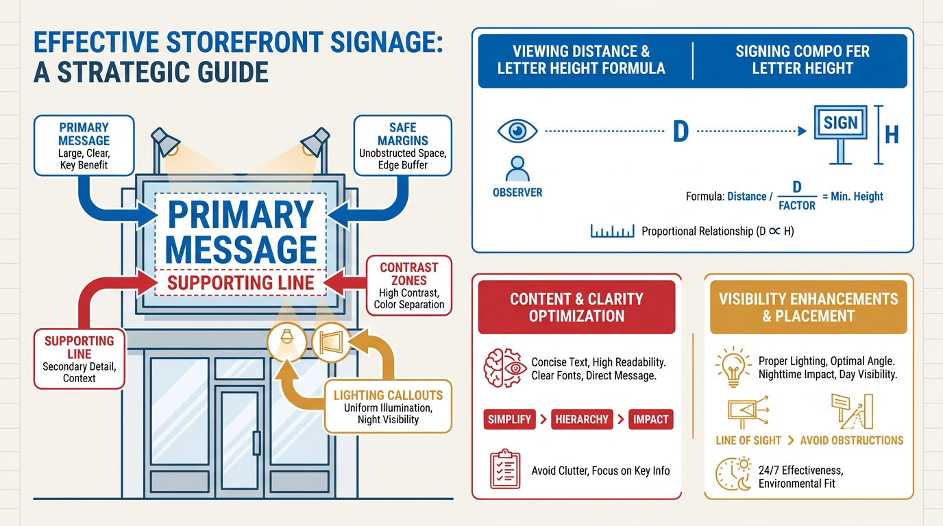
Lead with one primary message, your business name or main offer. Include one supporting detail when you have room, like your specialty or hours. Signs work better when they follow a clear order of importance because viewers can process information quickly.
For a fitness studio, "Maria's Studio" as the primary message with "Pilates & Yoga Classes" as support works better than cramming multiple services together. This approach also meets accessibility standards that help all customers read your sign easily.
Calculate Letter Size for Your Viewing Distance
Once you've clarified your message, the next step is making sure people can actually read it. Size your letters so people can read them from where they'll be standing or driving. Use this quick formula: letter height in inches equals viewing distance in feet divided by 20. For a storefront sign visible from across a busy street (about 60 feet), you'd need 3-inch letters minimum.
Choose Materials That Match Your Environment
Your sign's location determines what materials and finishes will last. Outdoor signs need UV-resistant materials and weather-resistant drainage systems. Indoor signs can use lighter materials but still need good contrast for various lighting conditions. Consider local building codes early, because some areas restrict illuminated signs or require specific mounting methods.
How to Choose Colors and Fonts for Your Business Sign
When you're deciding how to choose the right colors and fonts for your business sign, your goal is to instantly communicate your business’ energy and professionalism to potential clients walking or driving past. Your design choices need to capture attention, convey your brand personality and guide people toward your door within those brief moments of visibility.
Select high-contrast color combinations that ensure your message stands out clearly against any background. Dark text on light backgrounds or light text on dark backgrounds provides optimal readability, while strategic color choices can increase brand recognition and customer attraction by up to 80% when aligned with your studio's personality.
Limit your design to one primary font family with a clean, sans-serif style that reads instantly at viewing distances. Professional font selection directly impacts how customers perceive your business, with clear, bold typefaces like Helvetica or Arial communicating reliability and modern professionalism perfect for fitness brands.
Choose semibold or bold font weights for your primary business name and key messaging to maintain visibility from across parking areas and busy streets. Light or thin fonts may look sleek in digital formats but lose impact when scaled for outdoor viewing distances where legibility determines success.
Apply generous letter spacing and proper sizing to enhance readability at scale, following proven guidelines that recommend maintaining at least a 3:1 contrast ratio between text and background colors for optimal visibility in various lighting conditions.
Reserve bright accent colors for highlighting special offers, contact information or calls to action rather than primary text. This approach creates visual hierarchy while ensuring your main message remains easily readable for all potential clients, including those with visual accessibility needs.
Align your color and font selections with your existing brand materials to create a cohesive experience from your sign to your website to your studio interior. Consistent design elements across all touchpoints strengthen brand recognition and build the professional trust that converts passersby into paying members.
How Signage Design Can Strengthen Brand Identity
Your sign works best when it reinforces your overall brand message. Brand consistency across all customer touchpoints builds recognition and trust, and your signage plays a major role in that experience. When your exterior sign uses the same colors, fonts and logo treatment as your website, social media and interior design, customers immediately recognize your business. This visual harmony makes your brand feel more established and professional. Take Dottie's Pop Shop, where consistent color choices and materials across multiple sign types created a cohesive brand experience that customers could easily identify.
Beyond visual consistency, the materials and messaging you choose communicate clearly about your business personality. Brushed metal suggests premium quality, while reclaimed wood communicates natural or artisanal values, and illuminated acrylic conveys energy and modernity. Research shows that color choices significantly impact how customers perceive your brand, making material selection a strategic decision. Your message tone matters just as much. For neighborhood foot traffic, concise and friendly language with action verbs like "Join Us" or "Try Today" works better than generic taglines. When rebranding with signage, businesses often see increased customer engagement because their visual identity finally matches their intended brand personality.
Business Sign Design: Frequently Asked Questions (FAQs)
Running a business means making countless decisions, and sign design shouldn't feel overwhelming. When you're investing in signage that represents your brand 24/7, getting the details right matters. Here are answers to the questions that come up most often when business owners start planning their signs.
What are the most common mistakes to avoid when designing a business sign?
The biggest mistake is cramming too much information onto one sign. Keep your message simple and prioritize readability over decoration. Avoid using too many fonts, choosing low-contrast color combinations, or making letters too small for your viewing distance. Poor material choices for your environment can also lead to fading or damage within months.
How large should my letters be based on viewing distance?
A good rule of thumb is that letter height in inches should equal your viewing distance in feet divided by 10. For example, if people will read your sign from 50 feet away, use five-inch letters minimum. For faster-moving traffic or poor lighting conditions, go larger. The design tips page offers additional guidance on maximizing readability.
How many words should go on my storefront sign?
Limit your main message to 3-7 words maximum. Your customers only have three to five seconds to read your sign while passing by on foot or in a car. Focus on your business name and one key benefit or service. Save detailed information for window graphics, secondary signs, or digital displays where people can take more time to read.
What materials work best for different types of businesses?
Retail stores often benefit from illuminated acrylic for evening visibility, while professional services might choose brushed aluminum for a premium look. Restaurants and cafes work well with dimensional letters or wood finishes that feel welcoming. Consider your brand personality alongside weather conditions.
Should I work with a professional for my sign design?
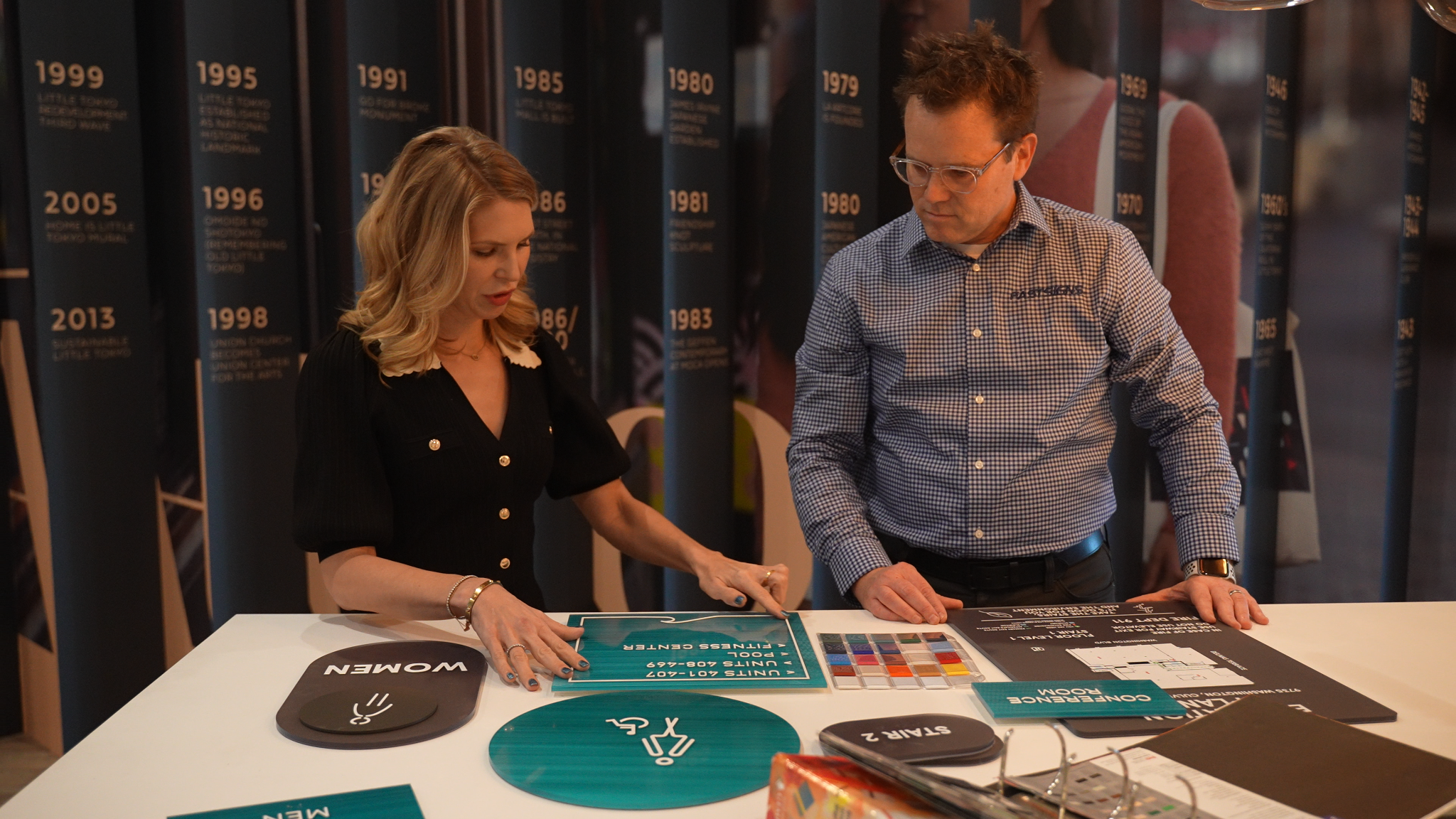
Working with sign professionals saves time and prevents costly mistakes. They understand local codes, optimal sizing for your location and material durability. A consultation helps you balance your vision with practical requirements like permits and installation logistics. Professional designers also ensure your sign coordinates with your overall brand while maximizing impact within your budget.
Next Steps: From Design to Installation
Creating an effective sign comes down to three fundamentals: planning for your viewing distance, choosing high-contrast colors with legible fonts and aligning all elements with your brand identity. When you get these basics right, your sign becomes a powerful tool that turns foot traffic into customers and communicates your brand values to each passerby.
That's where professional guidance makes the difference. Expert consultation helps you navigate code requirements and material choices, while design proofs let you see exactly how your vision translates to the real world. From there, expert installation handles the technical details, timelines and permits so you can focus on running your business.
Ready to create custom signs and graphics that make your business stand out? FASTSIGNS combines local expertise with national resources to guide you from concept to installation, with materials and finishes tailored to your indoor and outdoor needs.

.2502130905200.png)


.2502130905200.png)