Have you ever looked at a sign or a logo and the font makes it impossible to read what’s written?
Maybe it’s the opposite and the words feel bold and inspire strength. Fonts may not at first blush seem like part of an image but their visual quality can carry or break an effective logo. Different fonts are used to add style to a web page, visual, or document. They may be used to set or match the "tone" of the text based on the content. Additionally, certain fonts affect readability, depending on the medium. I want to explore the ideas of fonts in this post, and the ways in which they impact visual communication.
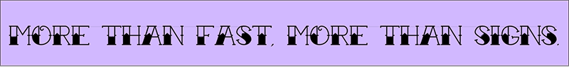
A font is described as a graphical representation of text that may include a different typeface, point size, weight, color, or design. Fonts are categorized into four basic categories. The first two are fonts that do and do not have serifs. A serif is a slight projection finishing off a stroke of a letter. Common serif fonts include “Times New Roman” and “Georgia”. Common fonts without these projections at the end of strokes include “Helvetica” and “Arial”. The other categories of fonts are scripts and decorative styles. There are believed to be more than half a million different fonts internationally. And while there exist thousands of subcategories to organize them, they all fall into one of these four categories.
.png)
The practice and study of fonts and typefaces is known as typography. It includes a broad range of study covering all aspects of letter design and application, both mechanical (typesetting, type design, and typefaces) and manual (handwriting and calligraphy).
How letters are formed into these fonts can fundamentally change the way we feel about the words they form.
San Serif fonts:
San serif fonts are easier to read in body text and are considered clean, business-like, modern, and approachable. While their main characteristic is a lack of serifs, they use simple clean lines that are the same width throughout.
For this reason, they are usually preferred for on-screen reading. Sans serif fonts give off a feeling of being casual, informal, friendly, and very approachable. Companies who want their brands to appear more youthful and relatable tend to use sans serif fonts. In today’s world, sans serif fonts are more popular in general than serif fonts.
.png)
Serif fonts:
Serif fonts are simple but inspire respectability, trustworthiness, and tradition. They date back to the 18th century when masons carved letters into stone and therefore offer a feeling of classic refinement. This usually makes them a good fit for companies who want to appear more reputable, established, and serious.
.png)
Script Fonts:
Script fonts mimic cursive handwriting. There are formal scripts and there are casual scripts. Script fonts have a more personal touch like calligraphy and handwriting. Formal scripts are very fluid and graceful, and often have connecting strokes. They are appropriate when an elegant, stately look is desired. Formal scripts are commonly used for invitations, announcements, and decorative initial letters, where their elegant look can go a long way towards setting a sophisticated tone.
Casual scripts are meant to look friendly and loose, as though quickly drawn with a pen, brush, or similar writing instrument. Their strokes can be connected or not, and the mood conveyed tends to be warm, personal and relaxed. Casual scripts are often used for ads, brochures, and anything that requires an intimate, informal look.
.png)
Decorative Fonts:
Decorative and display fonts became popular in the 19th century. They were used extensively on posters and advertisements, and were artistic and eye-catching in a way that wasn't considered previously.
Decorative fonts should be used exclusively for decorative or ornamental purposes. They are not suitable for use in body text. They tend to have a very distinct look, for example a wild west style, horror, or Christmas. They are used to decorate, embellish, and beautify text.
Any design you create is intended to elicit a specific response from the audience. The most common of these responses is a call to action. In the circumstance where the call to action is to motivate the audience to purchase a product, it’s imperative that the call to action aligns to the audience and appeals to them personally. In addition to carefully created imagery and selected colors, the font has a similar impact. For example:
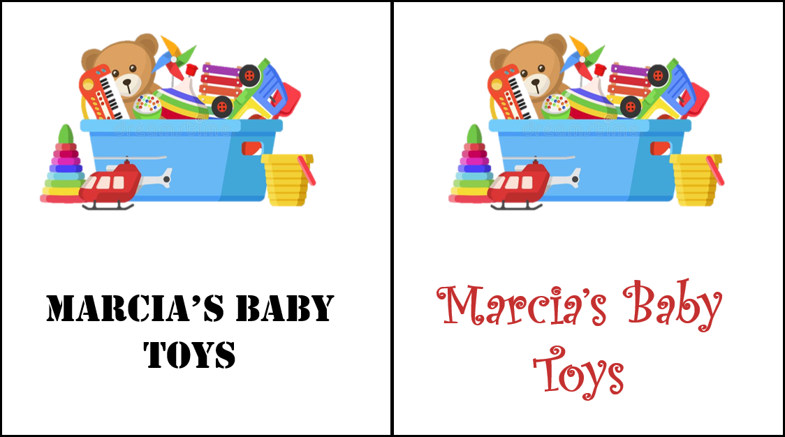
In this example, the words and image are identical. The only difference is the font. And while neither is incorrect, the image on the right elicits a more casual and fun feeling for the toys because of the script vs stenciled font style.
Talk with your print graphic designer about how to ensure that your signs are easily readable and visually stunning, but also elicit the emotional response from your customer that you want most. Remember, there are more than half a million unique fonts to choose from!
.jpg)