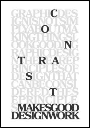
The design principle of contrast is as simple as black and white. Contrast is defined as the difference between elements in a visual production. The greater the difference, the easier each of them is to see and interpret.
Contrast used effectively in designs grabs attention. It better facilitates the three seconds your audience is spending with your piece. This distinction in elements is not defined beyond the concept of difference itself. It may be black on white, white on black, yellow on black, etc. The pieces you want to emphasize could be the larger or the smaller pieces, either will work in high contrast pieces.
Our eyes like contrast because it grabs our attention and makes it easier to digest and make sense of what we are seeing. This makes it a strong method to communicate visually, even without the presence of words.
One of the most important aspects of contrast is context. We may think that the chosen visual object in a piece says something about itself, but it is more often the visual elements around it that give it it’s meaning.
But when we add contrast to context things start to change. The black bird is immediately eye catching. It immediately emphasizes some importance to this example, although we don’t yet know what. But the contrast itself communicates to us that we should be paying attention to the black bird.

Contrast facilitates interesting relationships between visual elements in a design. It can push elements away, connect them, or complement them. Without contrast, visual elements can lose meaning and messages can get lost.
There are several different types of contrast, that vary in appearance. All of them can be equally effective, depending on the context in which they are applied:
Contrast in Shape
This type makes things notable by their difference in physical shape compared to other things on the page.
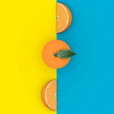
Contrast in color
Contrasting colors are colors that differ from one another. Levels of contrast vary from high to low, depending on their position on the color wheel.
Contrast in Scale
This type is another form of proportion. It’s all about comparing varied size relationships.
Contrast in Layout
This type can be as simple as moving structured elements into a non-structured pattern.
Contrast in Type and Color is very common in ads. It uses typefaces and or color contrasts to emphasize certain words and specific parts of the ad.
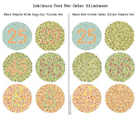
The other importance of contrast is designing for people that have some degree of colorblindness. Color Vision Deficiency (CVD) affects around 8% of people. That’s 8 out of 100 of anyone walking into your store, seeing your business card, flyer, brochure, decals, flags, vehicle graphic, yard signs, banners, displays, office signs, wayfinding signs…. You get the idea.
Going further into this subject requires a blog post by itself, but check this picture to see if you have any level of CVD is red-green.
Contrast can help move your visual communications into stunning and attention grabbing experiences for your customers. Partner with a graphic designer to help you apply the right contrast to your advertising and marketing materials.