Design Tips
Sign & Graphic Design Tips
Find out how to design signs that get you noticed. Here we’ve gathered together useful information about key sign attributes like legibility, visibility, viewing distance, letter and background color, and more.
Signs are usually the first thing that visitors notice, so it pays to make sure your signs make a good impression. Using imagination and proven design methods, your FASTSIGNS® consultant can help you turn your ideas into beautiful, high-impact signs and graphics that get results.
The most effective signs are:
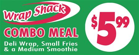
Enhanced with Color and Images. Did you know that ads with photos have 300% greater recall than ads without photos?* That’s a compelling reason to add pictures to your signs. Give your signs the greatest chance of being noticed, read and remembered—especially from a distance—by including full-color graphics in the optimal color combinations. Your FASTSIGNS® design consultant can help you make the best choices.

Best: Full-color graphics have the highest awareness of all sign categories.**

Better: Adding a border to your sign helps focus your customers’ attention so they can read it 26% faster. And by presenting special information in a second color, you can increase your customers’ retention by 78%—and draw a better response.*

Good: Signage builds awareness through low-cost, multiple impressions, reinforcing your advertising messages in other media.

Visible: Make sure your sign and its message are visible from the typical viewing distance—and that the sign is easily distinguishable from its surroundings. When you don't have room for large enough letters, try using light-colored letters on a dark background. The contrast will make the lettering appear larger, and viewers will find the sign easier to read.
Readable: Make it easier for customers to read your message by choosing a design that distinguishes individual letters. Studies have shown that black letters on a yellow background or yellow letters on a black background are the easiest color combinations to read, especially at a distance. Ask your FASTSIGNS® professional for good examples of other readable color combinations.
Noticeable: Draw your customers’ attention to your sign by changing its message, color, size or shape frequently.
Legible: Let your FASTSIGNS® consultant help you choose the right typestyles and spacing to help your customers distinguish letters and words. Click here to find a center near you.
* Source: Pennsylvania College of Optometry.
** Based on a 3M® marketing study on visual merchandising.

